


Client
Core Consulting
Services
Name Development, Corporate Identity, Digital Assets
Share



Overview
LMC Creative Concept developed the complete brand identity for The Core Consulting — from scratch. This included naming strategy, logo design, typography system, color palette, brand guidelines, and all digital assets. The name was strategically developed to reflect the firm's unique operating model: positioning themselves as the organizational center of every client engagement, assembling expert teams and managing complex projects from the core outward. The result is a brand identity that communicates precision, trust, and strategic clarity — ready to compete at enterprise level from day one.
Case Study: The Core — Brand Identity & Name Development
Client: Core Consulting GmbH
Services: Name Development, Corporate Identity, Brand Strategy
Industry: Management Consulting, Digital Transformation, ESG
The Challenge
A newly founded consulting firm with studios in Berlin and Stuttgart needed more than a name — they needed an identity that could hold its own in a competitive market dominated by legacy players. The brief: create a brand that signals expertise without arrogance, and clarity without cold corporate distance.
The Naming
The name The Core was born from a simple but powerful observation about how this team actually works: they don't sit on the sidelines. They position themselves at the center of every operation — assembling the right experts, coordinating moving parts, and driving the project forward from the inside out.
Like the core of an engine, or the nucleus of a cell — everything revolves around it. Remove it, and the whole thing falls apart.
That's The Core. Not a consultant you hire and forget about. The organizational center of gravity that holds every great operation together. The name captures both what they do and how they do it: they gather the team, manage the complexity, and sit at the heart of every project they touch.
The Identity
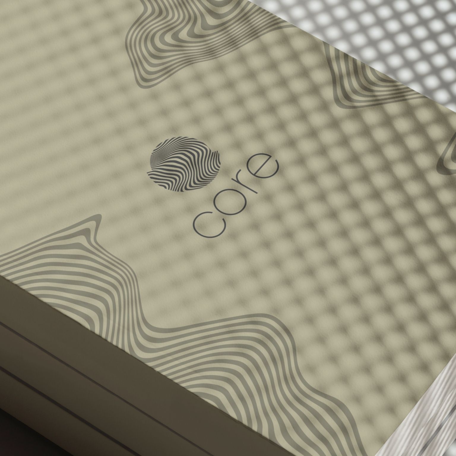
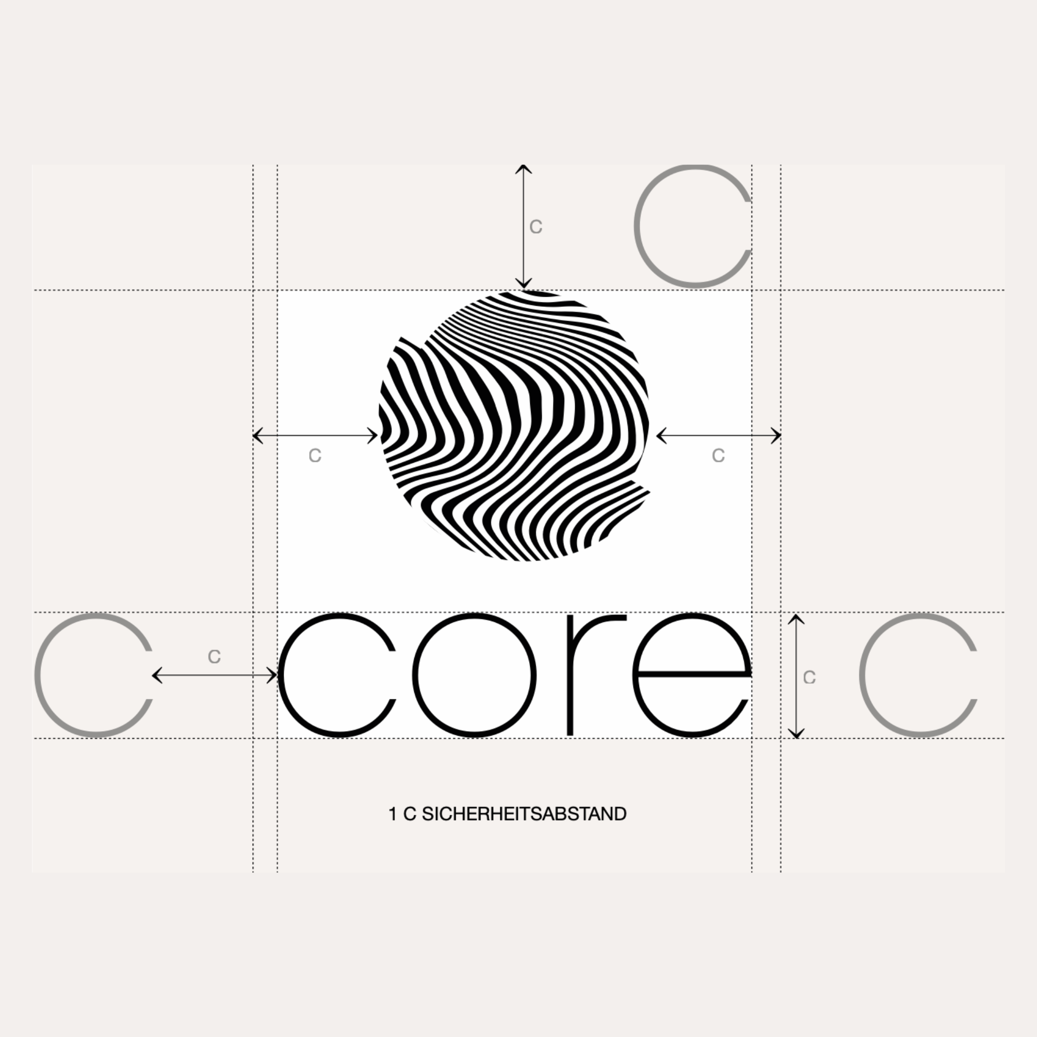
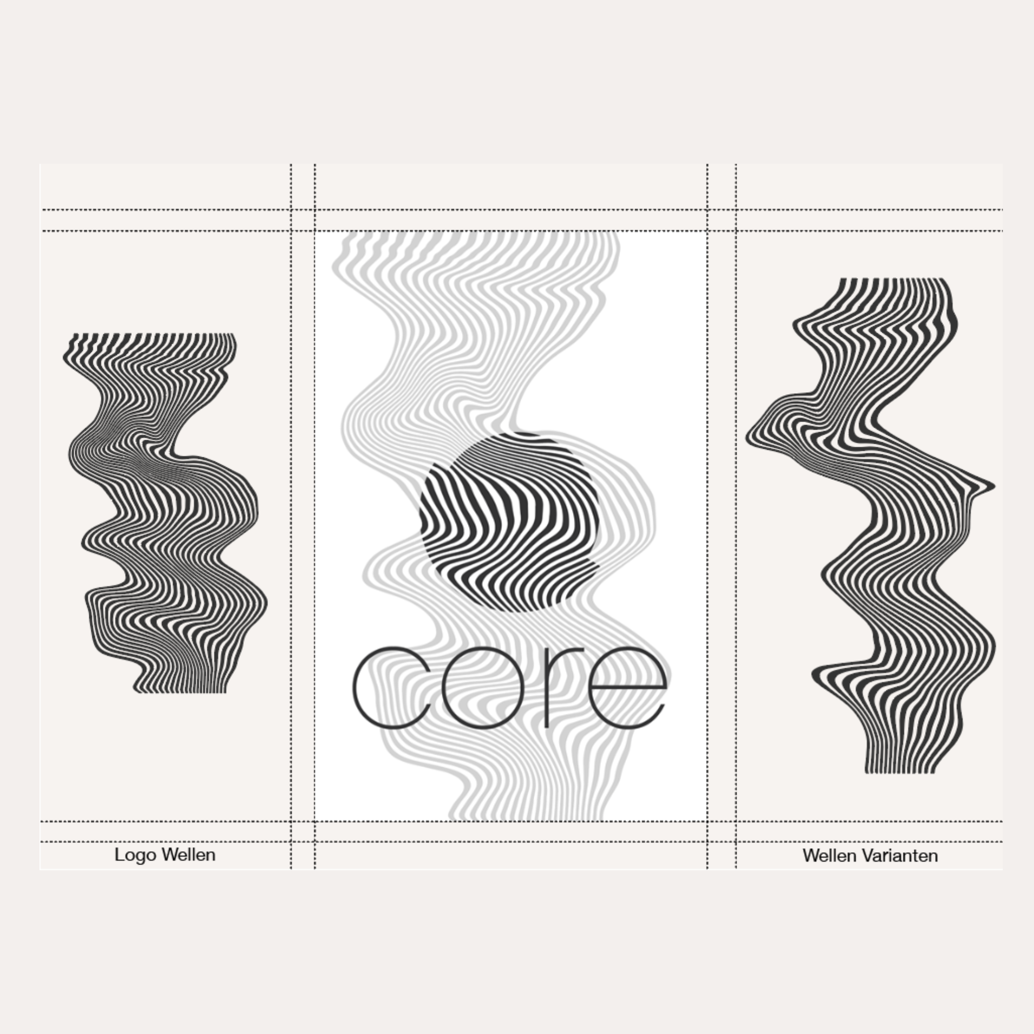
The visual identity translates the name's philosophy into form. A refined typographic system built on geometric precision — no decoration, no noise. The logomark carries structural confidence: circular, balanced, and immediately recognizable even at small sizes — a deliberate nod to the idea of a central point everything orbits around.
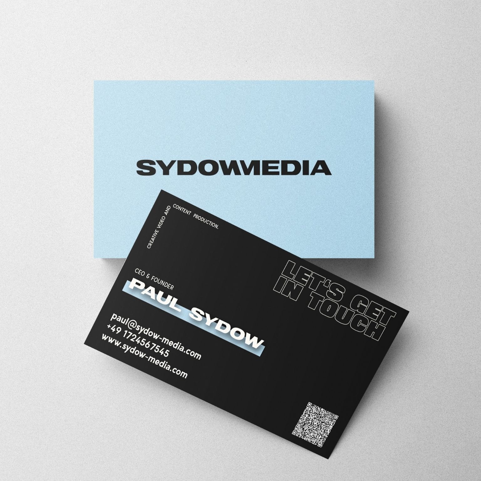
The color palette pairs deep neutrals with clean whites, signaling trust and professionalism without retreating into the generic grey of traditional consulting. Every touchpoint — from business cards to brand guidelines to digital assets — was designed to communicate one thing: this is a team that knows exactly what it's doing.
The Result
The Core launched with a complete brand identity ready to compete at enterprise level from day one. The name has proven highly memorable and strategically sound — it scales across industries, markets, and languages without losing meaning.
Built from the center out. Just like every project they run.




Pricing
